The Big Brown Truck of Happiness dropped off a shiny new Kindle 2 yesterday.
Unboxing photos and more after the page break.
The box the Kindle 2 comes in is almost Apple worthy. Minimalist, with cool graphics that tie everything together. The only down side is that the nice black packaging made me wish even more that the Kindle was available in anything other than white.
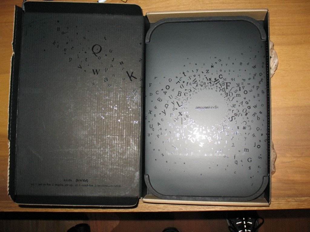
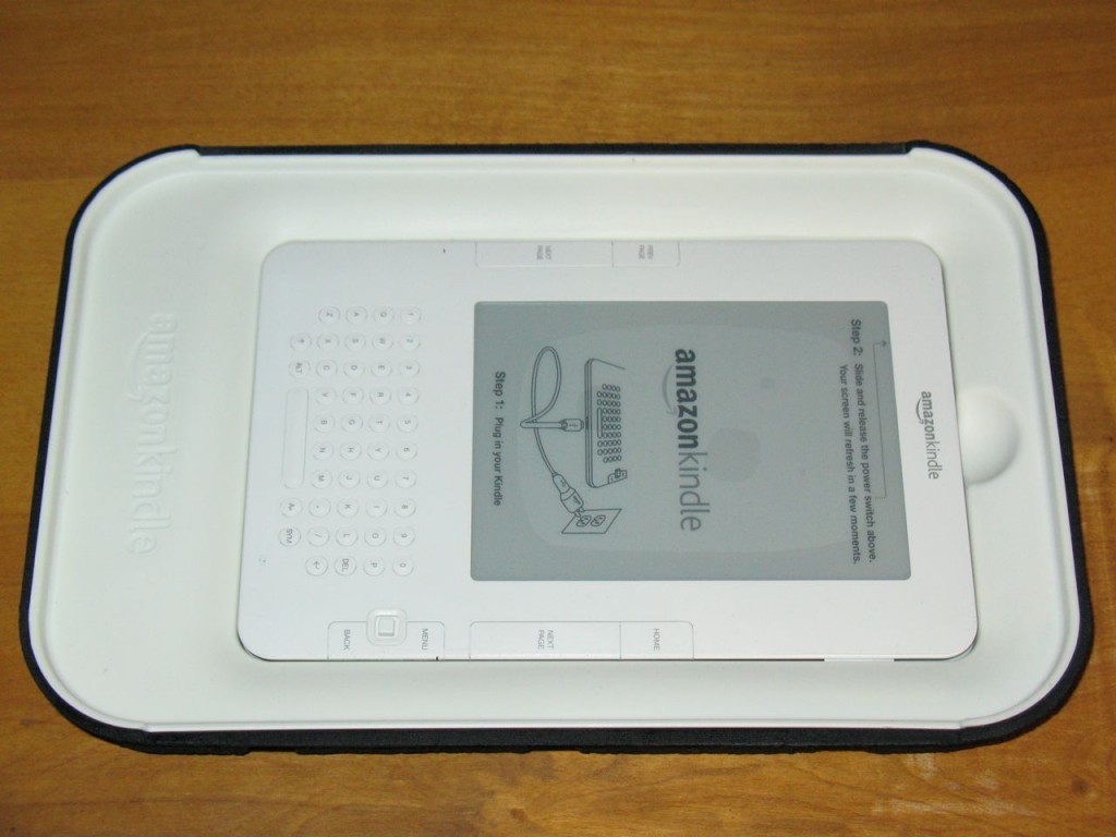
Inside the box, there’s just the K2. Nice and simple.
Under the K2 there’s a small getting started booklet and a power cord.
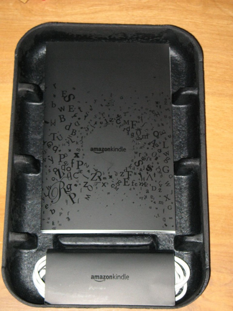
What’s in the box:
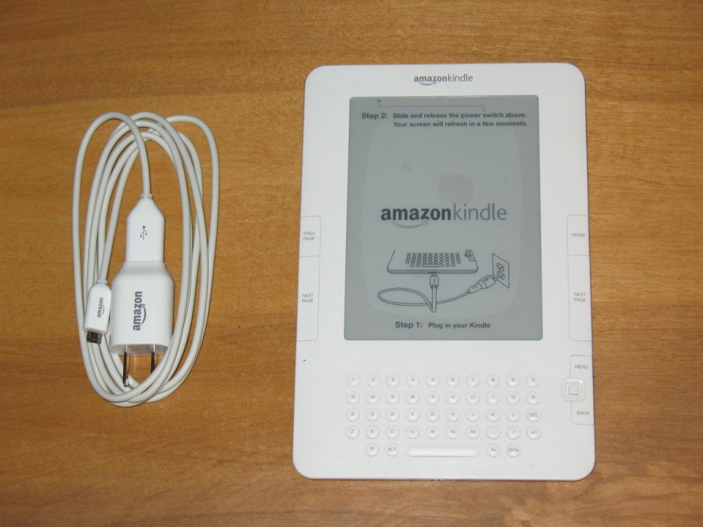
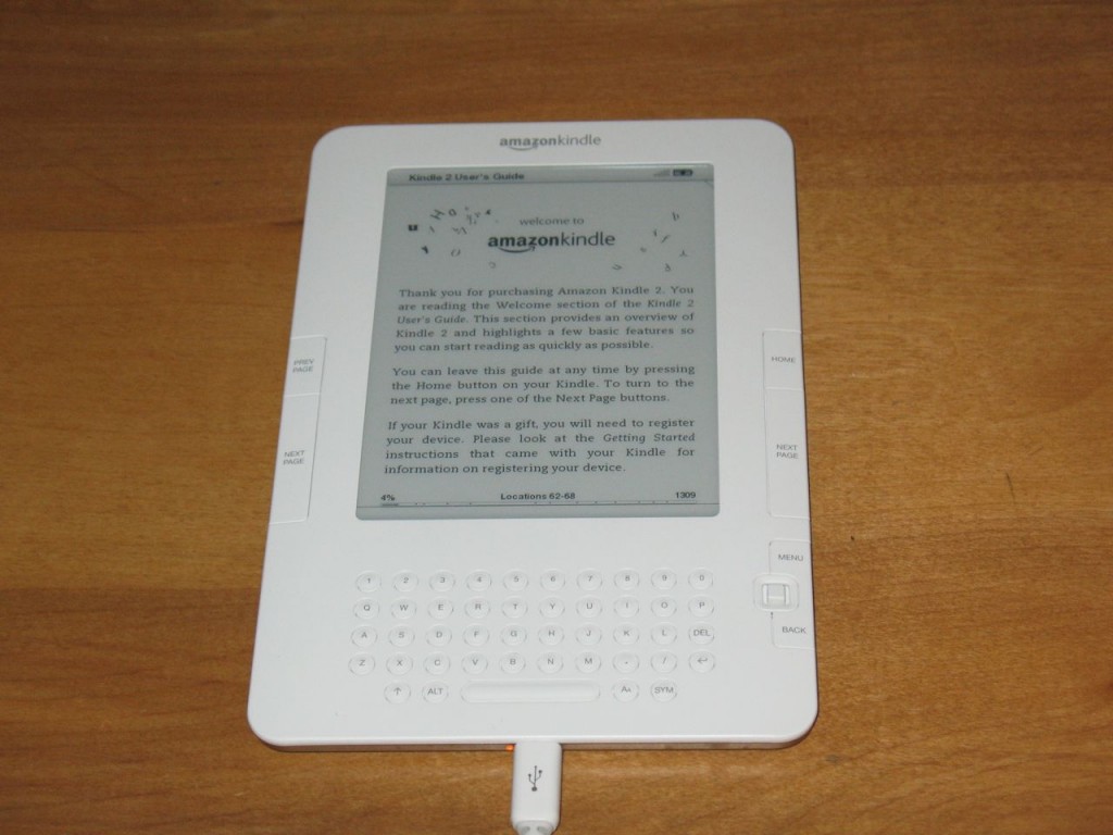
Amazon eliminated the separate power connector for the K2 and used the industry standard micro USB connector. That means I don’t have to make a USB charging cable for this one. Although a micro USB cable doesn’t come with the Kindle 2, you can find them everywhere pretty cheap. The data transfer rate is much faster on the Kindle 2 which almost makes up for the lack of a memory expansion slot.
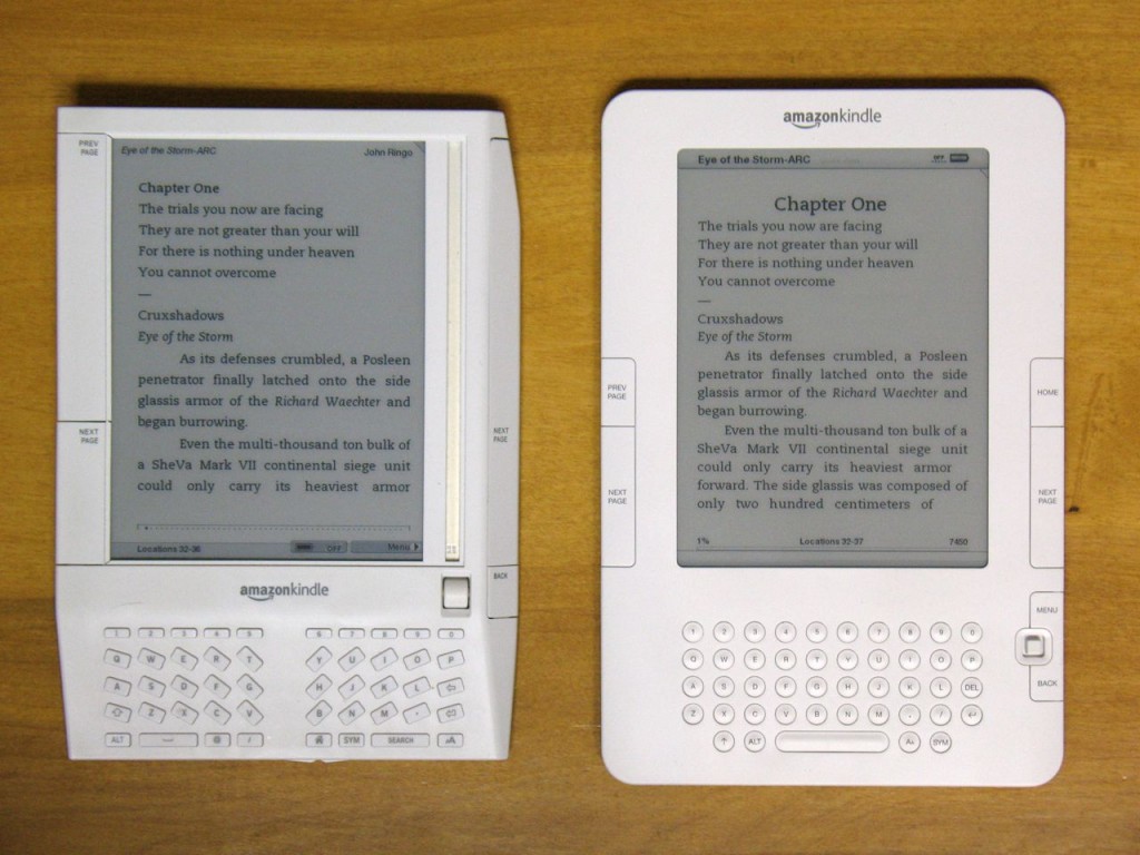
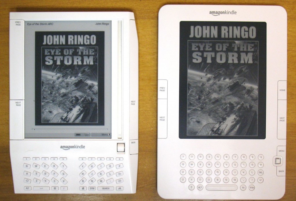
Kindle 1 and Kindle 2 side by side. There are some text formatting differences and the screen on the Kindle 2 is noticeably lighter. The K2 page turn is faster as well. The page turn buttons are much better on the Kindle 2. With the Kindle 1 is was very easy to accidently press a page turn button.
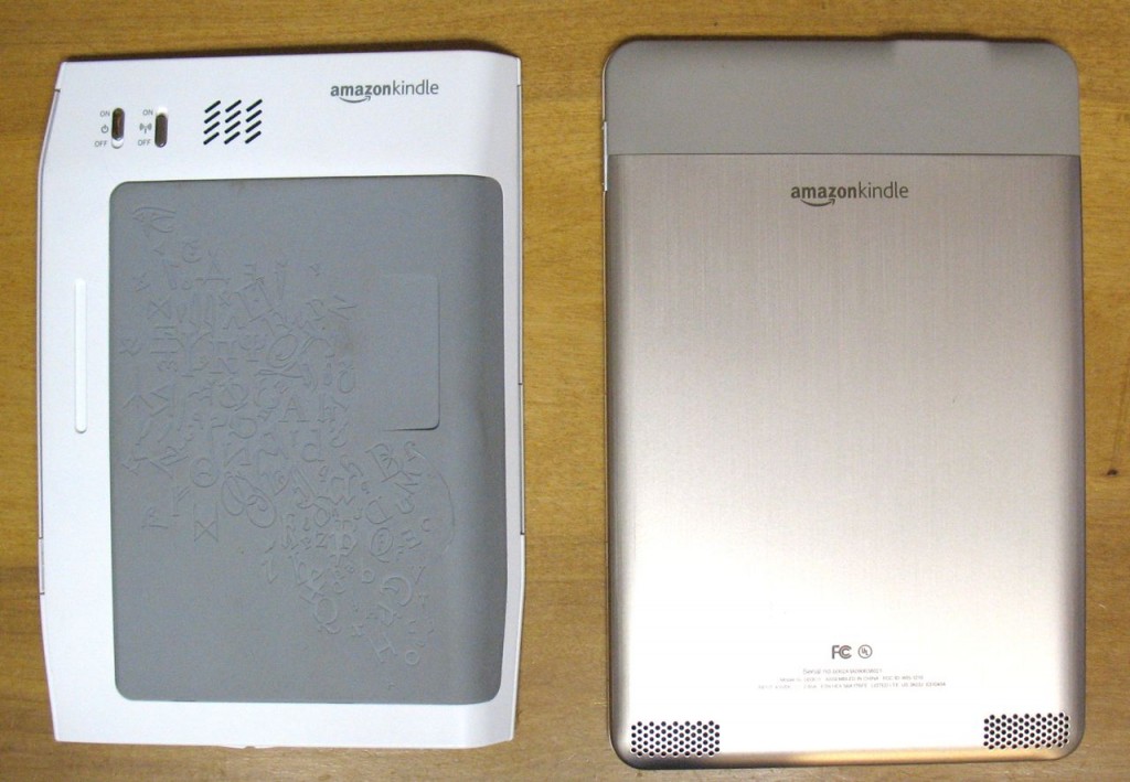
The back. Kindle 2 has a metal back and there’s no user replaceable battery. (something else Amazon learned from Apple.)
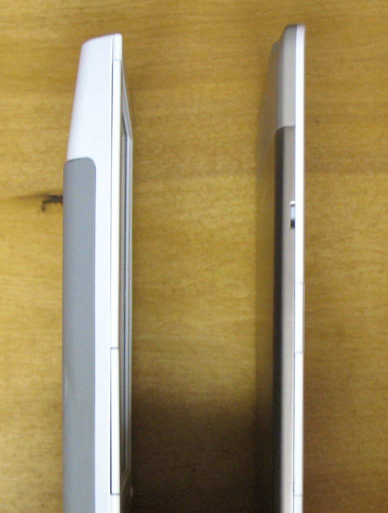
and the side.
The Kindle 2 supports more shades of grey, so graphics are much improved.
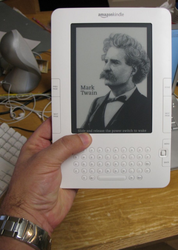
And it fits nicely in my hand.
The Kindle 2 is what the first Kindle should have been. It’s not a huge improvement, and if you already have a Kindle there’s not much of a reason to get the Kindle 2. If’ you’ve been waiting though, this is the one you need.
The reading experience on the Kindle is great. There’s no backlight, so it’s as easy on your eyes as a dead tree book. It’s light and easy to hold.
I’m reading a dead tree book now, because it’s not available as an ebook, and I’m surprised at how much I don’t like having to hold the book open and manually turn pages. How quickly we get spoiled.
UPDATE: I didn’t even notice, but the included charging cable is actually a USB cable that disconnects from the power adapter. Thanks Frank!


It looks good! I like the curved edges on both the device and its screen-window. Our Gemstar eBook had 16 shades of gray (another was color, 32K VGA) – that’s about all that’s worthwhile unless you cram more and smaller pixels in there for hi-def. I worked on that grayscale range because we needed to keep 16-shades intact even if someone cranked up the brightness/contrast – so it was sliding scale and a moving target.
Very cool. I wish I had one.
Take it on an airplane flight and show it to the crew. I did that with one of our RB1100’s and found out that they’re practically the ideal market. Most read, share, and trade an enormous number of paperbacks – one Steward told me he read probably eight to eleven(!) books a week. If only our CEO hadn’t cooked the books with his GF-CFO and gotten into hot water with the SEC, we were *this close* to going right-side up on our burn-rate, we were selling more and more, but the Intern3t was still young and the origami unfolded differently.
You dont need to purchase a seperate usb cable. The power adapter in the package is actually a micro-usb cable plugged into a small usb power adapter. just hold the part of the cable with the usb logo and pull the adapter off.
Excellent review. I could see differences between units specially in images quality. Thanks!