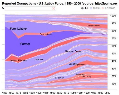
This is very cool. Job Voyager “shows stacked time series of reported occupations in the United States Labor Force from 1850-2000. The data has been normalized: for each census year, the percentage of the polled labor force in each occupation is shown. The data is originally from the United States Census Bureau and was provided by the University of Minnesota Population Center”
Click on the picture for the Interactive Job Voyager. (But only if you have some time to kill)
By mousing around on the live graph you get a feel for how the occupations have changed over the decades. One thing that stands out to me is how much more diversified employment is today compared to a hundred years ago.


What jumps out immediately is the lack of farms/farmers to produce food…